If you happened to be in Carmel (California) this weekend, check out the 40th Annual Carmel Surfabout!
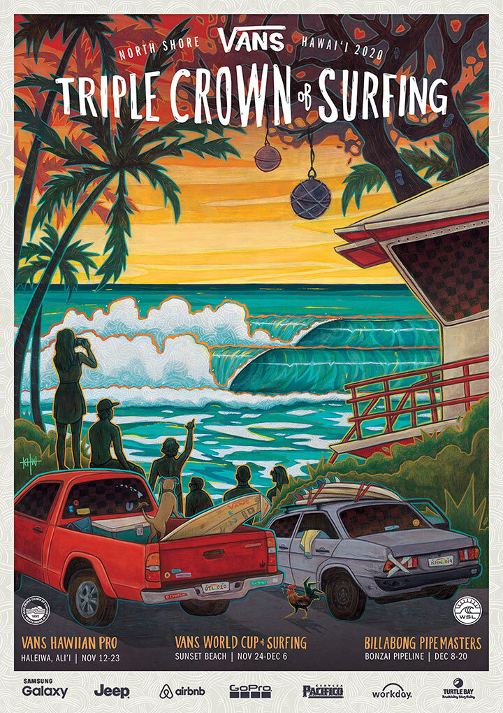
These guys found my Vans Triple Crown poster online and reached out to do a special poster inspired by it to commemorate 40 years of their surf competition —but with their local landmarks, like the cypress trees, 11th street bench/stairs, and the Frank Lloyd Wright house, to name a few.
I had lots of fun “walking” through Carmel by the Sea on google maps, and hope to see it in person one day!
Mahalo Andrew for connecting and good luck this weekend!
Lucky 7 Grateful Dead Tribute Concert poster
Happening tonight! May 7th 2023, The Stephen Inglis Project recreates the Grateful Dead’s May 7th, 1977 Boston Garden concert in its entirety at the Waikiki Shell Amphitheater, in Kapiolani Park.
I had lots of fun learning about the band and hiding iconic easter eggs/Dead references around the illustration. Mahalo Mark Tarone for the fun project!
You can find more info about the concert here, and shop t-shirts and posters here.
2020 Vans Triple Crown of Surfing
I’ve been waiting almost two full years to post about this project! At the beginning of 2019, Vans commissioned me to create the poster for the 2020 Vans Triple Crown of Surfing. It was a dream project, working with a dream team. As a lifelong Vans fangirl, I am beyond excited to cross it off my bucket list. (I was also hired to do a “prequel” poster for the 2020 Vans Pro, but the event was cancelled… so I’not sure where I stand on being able to share the artwork.)
Because of the pandemic, many events have been cancelled this year, but the VTCS is still on and going digital —the competition will run without a spectator audience.
Above is the official 2020VTRCS trailer that Vans released a couple of weeks ago. Below is the original poster artwork and design I created last year.
My original design for the 2020VTCS poster (with mock dates and sponsor logos).
The competition historically has three main events that take place at three different beaches on the North Shore of Oahu, during Hawaii’s infamous winter swell. I took design inspiration from the “high surf” warning signs that take up permanent residence along the coastline during this season. Like the high surf signs, my illustration centers around a diamond shape that houses the infamous North Shore waves, vignetted by trees, spectators, local cars, and a lifeguard tower. All surrounding elements are a collage of the three event stops: Haleʻiwa Aliʻi Beach, Sunset Beach, 'Ehukai/Pipeline, (and even a little bit of Waimea Bay).
Process work
Custom surface pattern, and typographic treatment to the VTCS logo/event locations.
Before the final typographic treatment was approved, I pitched an idea that included a little crown icon with the logo. We moved in a different direction, but I thought it would be fun to add a “Where’s Waldo?” element to the poster, and hid a number of little crown icons throughout the composition (this would have been more entertaining had the big tents and event banners been printed, and you could search for them on site). Many of the crowns are covered by the logo up top, but who doesn’t love Easter eggs? See below for the ones I can remember putting in.
Hidden crown icons
You can find more info about the competition at vanstriplecrownofsurfing.com, and official merchandise at www.vans.com.
Special thanks to Jenny, Nate, Seb, Chase and the rest of the VTCS crew!
Aloha From Hawaii Festival
I was recently asked to do some artwork for this year’s Aloha From Hawaii Festival. The guys from The Green liked the styling and subject matter of my recent Pow! Wow! mural on Coral Street (Kakaako, HI), which incidentally is the same location as where the festival will be taking place. Can’t wait to see the show!
The first pic is my illustration, the second and third are their festival posters done by their designer.
Big thank you to The Green, Kamea Hadar and Kimo Kennedy! You guys rock.


